 Laravel Development
 React Development
 Vue.js Development
 Angular Development
 Node.js Development
 Python Development
 NativePHP Development
 Flutter Development
 Electron Development
 iOS/Swift Development
 MongoDB Development
 MySQL Development
 PostgreSQL Development
 DigitalOcean Development
 AWS Development
 Azure Development
 Strapi Development
 WordPress Development
 Shopify Development
 ConnectShip Services
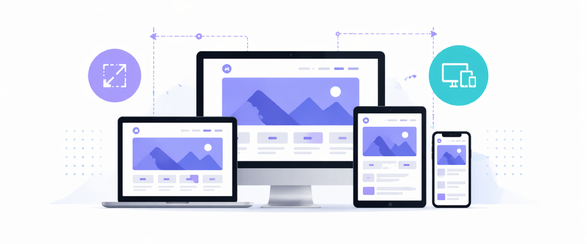
Designing for different screen sizes & devices
Overview
Some simple principles regarding designing for various viewport sizes and also illustrating some common practices, stuff that you should be mindful of as a designer working on digital goods or services.
There are 4 types of layout for displaying:
- Fixed Layout
- Fluid Layout
- Adaptive
- Responsive
1. Fixed Layout
The fixed-layout has a fixed pixel width. The website's 'container' is designed to stay still. This distance remains the same no matter what screen size or resolution the viewer has. The width of 960px tends to be the highest used size for fixed-layout websites
The disadvantage of a fixed layout is that you have a terrible horizontal line, breaking the summary which suffers from flexibility when displaying such style on smaller displays.
2. Fluid Layout

With the fluid layout, you define dimensions in percentages instead of pixels. Therefore, the proportion of items would stay the same if the screen size increases.
The disadvantage of a fluid layout is that the columns will get very thin on the smaller devices. Now picture how it appears like a block of text in a small, really large container. Or, incorporating other items such as images and video that will stay at a defined scale. The mixture demands difficulty.
This style is more responsive than fixed. Yet it only looks like a good thing in comparison to the other possible solution. Designing a fluid layout interface that would look nice on both large and small screens is still very difficult.
3. Adaptive

The adaptive layout indicates that multiple versions of the template are displayed, depending on the viewer's screen size. Think about it as many fixed design layouts, if the panel size is within the scale range N — NN, then model A is shown. That's good for efficiency and should be specifically designed for any width device.
4. Responsive
The responsive design combines the best of the fluid and adaptive design realms. There are so many breakpoints which divide ranges into all possible screen sizes.
This design has a subtle layout, depending on the size of the device you are using, elements can often expand or shrink appropriately.
Responsive Web Design
Responsive web designs are widely popular these days. Responsive web design is a web design technique that lets websites render usability on a variety of screens or window sizes.
Some popular frameworks of responsive web design:
- Bootstrap
- Foundation
- Uikit
- Semantic UI
- Siimple
Let's discuss more on each.
Bootstrap
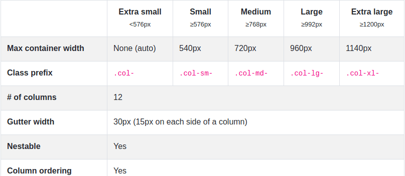
Introduced as 'Twitter blueprint' initially. Bootstrap is the most common, quickest and user-friendly framework. Bootstrap is a free front-end library, open-source, with a 12-column responsive grid interface. Bootstrap is used for developing flexible and mobile-first development designs.
Bootstrap contains five of predefined classes to create complex responsive grids. Customize the width of your columns on devices that are extra small, small, medium, large, or very large, as you see fit.
Foundation
This framework is a common option for designers and developers because it is appropriate for any device, medium, or accessibility. The Foundation framework provides a collection of responsive front-end systems that render in creating responsive websites, applications, and emails simpler. These look stunning on any device, whatever the size of their screens.
When you're a newbie, this is obviously not the framework you're searching for. It is relatively complex and not ideal for people with unfamiliar frameworks. You can easily develop stunning applications, newsletters, and websites that look mindblowing on every device if you have had previous experience. The framework of the Foundation is flexible, easy to read, semantic and easy to customize.
Uikit
UIKIT is a highly modular, lightweight front-end framework that helps build powerful and responsive web interfaces. The important aspect used in this framework is that it contains preprocessors for both the SASS and LESS CSS.
It contains elements such as HTML forms and tables, Navigation components such as side navigation bars, and JavaScript components such as modal dialogs and off-canvas bars. It also contains common elements such as badges, buttons, and overlays, and components for the layout with a completely responsive grid.
Semantic UI
Using the Semantic UI framework, you can build many beautiful, user-friendly, and responsive websites. Because of its simplicity it became one of the most common front-end frameworks. Since it uses natural words, the code itself is self-explanatory.
A large range of third-party libraries is built into semantic usage. In reality, you won't need to use any other resource and thus the whole process of development is a little simpler.
Siimple
It is a lightweight, flexible, quick, and open-source framework that can be used to build websites that are flat and clean. It is designed using SASS and can have a perfect base for website building.
Siimple provides a flexible grid system of 12 columns, which can be used to create responsive web pages. These web pages are readily available through all forms of devices, irrespective of their screen sizes. Siimple becomes complete with an elegant, modern, simple, minimalist design. You may use the intuitive classes Siimple offers to customize your elements.