Marketing is Mobility, and what’s more proficiently mobile than a smartphone!
The world is turning mobile first, and naturally, businesses are following suit. In 2017, Mobile marketers are going to make the best bet by enhancing their strategies and leveraging maximum advantage of people’s mobile-friendly approach to daily life.
Trend is that scenario where the majority of people redesign their needs to be able to make use of “something”, that is primarily intended to address the need of a few people.
There are several trends that marketers will look forward to in the coming years.
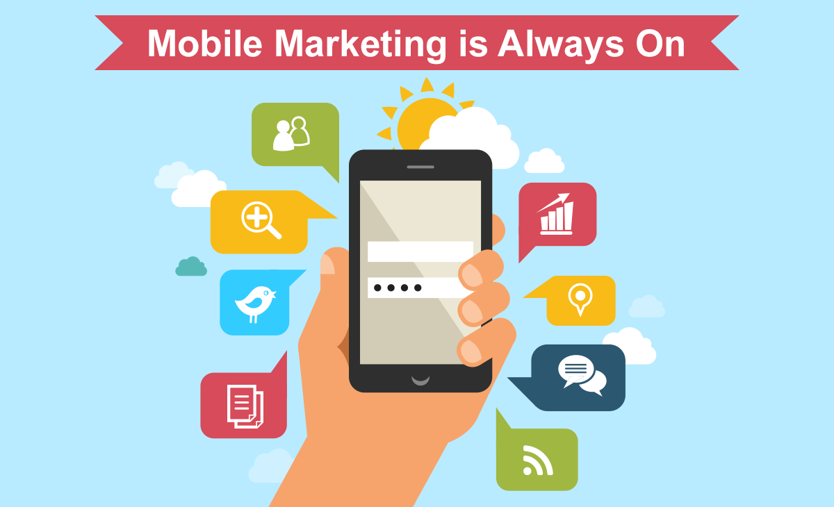
What’s in it for the marketers…
On one hand, the line between bigger gadgets and smaller gadgets is getting darker and more prominent( in terms of content at least), on the other hand, the line between mobile apps and mobile web is blurring. Going forward, the intention is to make the line completely disappear, for good. For good or not, it is certainly on the trajectory of how ‘trends’ are going to turn out in the future.
Majority of the smartphone users use only between 3 to 5 apps on their phone ‘regularly’. Let’s presume at least half of them happen to be social-media web apps like facebook and instagram. It is easy to see why marketers in near future will target ads on social media. It is said that in 2017, more and more of these messaging apps will become a standalone marketing ecosystems.
Why you’ll keep your money where it is..
You’ll probably still have to keep your “carry-around” money in your leather wallets. Mobile wallets, although set up to make an impact in a big way , won’t catch on completely in the near future. Although retailers shall provide concurrent support looking at its bright prospect later down the line.
Mobile awareness has risen, although mobile wallet adoption has raised only 1% in 2016. It seems as if people will prefer traditional currency at least for a few years before taking that massive jump to digital currency compromising on what seems to be one of the longest collective tradition of the humankind.
On a positive note, more and more businesses in 2016 were seen adopting mobile wallets and accepting mobile payments. In 2017, the trend is said to grow from where it currently sits and marketers are asked to watch out for it.
How Quality will still be a concern..
Content, Design, Device-Compatibility, and things like these. Quality Engagement has always been a thing that could been improved upon, and now it is a question that matters more than ever. Marketers are avoiding click-based programs while focusing on quality engagement to their users.
An average mobile app loses 77% of its users in the first three days of its use. Here, quality engagement includes getting rid of all the unnecessary and giving the users unhindered interaction. Google Algorithm, “TopHeavy” discounts web pages with too many ads on its home page. This by itself should ward off websites from pulling off too many irrelevant ads on their webpages.
How mobiles will save you from tripping outside store windows..
Dynamic content will enhance the ‘window shopping’ experience for mobile users. Thanks to latest technology, people will not have to leave their rooms to battle anxiety or depression anymore, ‘window shopping’ is going to be an experience under one’s own roof. They’ll be able to virtually browse through different sections of the store, select, cart and compare the objects they wish to chose from.
User’s are searching for locations, brands, products, reviews,best prices, discounts and almost everything relevant to shopping on their smartphones. This gives them exactly the right information they are looking for even before entering a brick-and mortar location
Keeping up with the trend is good, but in order to be truly work wonders in the age of mobility, marketers need to make sure that the business is mobile-friendly from the ground up. Having a responsive web design and/or a mobile app is seldom not enough and would hardly make for a good return on investment.
Marketers who think they are smart enough to figure out what changes on the desktop versions of their website will qualify them to be called “mobile-first” will never truly become mobile first, simply because they do not consider the idea that mobile screens are meant for information that is less verbose and consequently more concise, crisp and “on the money”. Here, brainstorming might help grind out some thoughts on how to market one’s brand rightly on mobile screens, where in of course, there are multiple factors to be considered. Research upon your audience and find out ways in which you can optimize marketing your brand.
As long as we’re talking about brands, communicating your brand to your user base is the marketing tip of all icebergs(businesses). Mediums like colour, font, size of the font, logos, moods & tone of the content (preferably similar across all devices) can breathe your brand into everything marketers do for their business. That should be the aim!
Good images that are easy on the user’s eye are also the best alternatives to be used as pockets of important information (underlying or obvious) to trigger the user’s stimulus ultimately driving them the CTA button. While we’re thinking of ways that makes the user’s experience “easier” on your app, make things scrollable. A standard layout can never go wrong; and so can’t a standard navigation.
Calls To Action have always been something of a mystery to be solved by businesses in wondering what kind of CTA button drives in the maximum number of consumer. On mobile screens, the pursuit remains. Although there are basic fundamentals that are research-proof like using big buttons that outright visible.
Mobile SEO
A website on mobile contains a lot less information than its desktop counterpart, which gives way to much faster optimization.
- Google announced that 50% of all web activities are performed on a mobile device like a smartphone or a tablet. This simply means that phones get higher priority in Google’s indices from now on.
- To meet the growing demand, Google has started to test their mobile-first index
- Google systems will be favoring mobile content over desktop before ranking search results.
- Desktops exclusive websites do not work well on mobile devices, it is recommendable to work out a way so that desktop sites give a mobile-friendly vibe too.
- A mobile screen is much smaller as compared to a desktop device, so the content made for a desktop screen probably would not fit right in a mobile-screens dimensions.
Be truly mobile-first instead of making a site for desktop first and then crunching down its content to fit mobile screens.


