Overview
Customers want a quick, intuitive experience regardless of how they discover you online, from smartphones and tablets to voice assistants. But what does this mean for companies who already have websites? Do you need to spend money on a new website design and development? Is it just a mobile refresh? What’s the difference between mobile and traditional web design, and how does it affect your company?
What is Mobile-First Design?
Mobile-first web design is a method of developing websites that begin with the smaller mobile screens in mind, intending to provide the greatest possible user experience for those using smartphones to access websites. The heart of mobile-first web design is simplicity and minimalism. Web designers and developers may help visitors have a more seamless experience by developing a website with smartphones and tablets in mind. In addition, mobile-first sites can:
- Enhance the user experience on mobile devices.
- Make use of the phone’s built-in functions.
- Save the money you would have spent on more costly solutions like apps.
- Increase reach and visibility by assisting users in focusing on important content.
- Make navigating simple.
Phases of Mobile-first design:
You need first learn the two terms below to comprehend the notion of mobile-first design better.
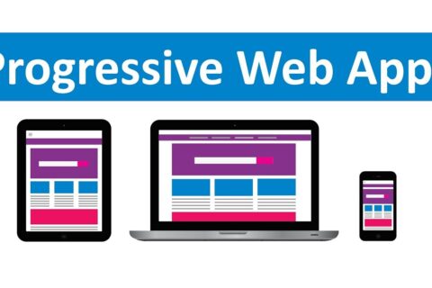
Responsive Web Design (RWD): Responsive web design is a web design technique that allows websites to adapt to the displays of various devices, showing content in a way that makes users feel at ease automatically. Users’ online browsing tasks such as panning, zooming, and scrolling are considerably reduced due to this.
“Progressive Advancement” & “Graceful Degradation”: These two ideas came before responsive web design. Designers produce customized versions of products for various purposes to make online or application interfaces display adequately on various devices.
Progressive Advancement: It refers to the fact that when we construct a product, we first create a version for the most basic browser. The most basic functions and features are included in this edition. Then, for a better user experience, we move on to the advanced version for a tablet or PC, which is built by adding interactions, more intricate effects, and other features to the basic version.
Graceful Degradation: On the other hand, it begins with an advanced goal, such as a desktop, and produces a version with well-rounded features from the start. Designers then modify the product to make it compatible with mobile devices by removing some functionality or information.
If UI/UX designers start with the desktop version of a product, they will almost certainly want to take advantage of the advanced features. However, suppose we start with mobile end product design. In that case, designers will naturally capture the essential elements of a product, aiming for a lean and clean product with prioritized functions, despite constraints such as bandwidth, screen size, and so on.
What is Mobile Web Design?
It’s all about accessibility and lead generation when it comes to mobile web design. It’s vital for a website’s success and efficacy to make sure its material is available to as many people as possible. Before you start planning a project, you should familiarise yourself with two major industry terms: responsive web design and mobile-first design.
Responsive web design:
Responsive web design refers as web design and development strategy that strives to provide the best possible user experience across a wide range of devices and browsers. Responsiveness is achieved by coding that allows the creative parts of your site to shift and change, presenting graphics, copy, and navigation to suit the visitor’s reading environment. The rise in popularity of smartphones, as well as the advent of tablets, prompted this trend. As the number of devices on the market has expanded, so have the best practices for responsive web design. Responsive Web design will refer to the idea that design and development should adapt dependent on screen size, platform, and orientation, to the user’s behaviour and environment.
A normal website comprises a collection of files (each web page, such as the home page, about page, and so on). HTML code and content are included in each file (text and images). Cascading Style Sheets (CSS) files are used to style web pages (CSS). Depending on the device used to view the site, a responsive website uses a different CSS file set. Depending on the device, the site appears and acts differently. Most small and medium B2B organizations still favor responsive web design, according to the research. Data demonstrates that a large number of their visitors use desktop computers to search and visit their websites. On these websites, we plan, design, and develop for the desktop experience first, and then, at the conclusion of the process, we effectively construct an optimized mobile experience.
Mobile-first design:
Many businesses, particularly those in the B2C sector, are pursuing mobile-first design. In this strategy, a website is designed and built first for mobile devices, then for desktops. If your user research and audience data show that mobile and tablet users are the majority of your site’s visitors, mobile-first design may be the best option for you. After all, your users should be at the forefront of any website overhaul.
Benefits of Mobile Responsive Design
The most important advantage of a responsive design is that it ensures that each user on any device has the greatest possible experience on your site. And, most importantly, the most reliable. Website responsiveness is also an excellent method to improve your site’s content, ensuring that visitors on mobile devices only view the most essential information. The Google algorithm update has increased the exposure of responsive web design on search engines. It’s mobile-friendly; therefore it’s a good choice. A site with an excellent mobile experience will rank higher in search results than one that does not.
The Importance of Responsive Design in business are the following:
- Expand your customer and client base by using smaller devices (tablets & smartphones)
- A consistent experience that can help you generate more leads, sell more products, and convert more customers
- All of your analytics, tracking, and reporting can be found in one spot.
- On-site content management saves time and money.
- Keep one step ahead of the competition.
There are two other ways to provide a mobile-friendly experience. Dynamic Serving is the first option, which uses the same URL but new HTML and CSS code. Pages recognize which device is being used and serve up the appropriate code. The second option is to create a specific mobile site. When users access the site via a mobile device, they are directed to a mobile-specific URL. The most useful strategy truly depends on every individual case, as long as the proper measures are made to optimize correctly for mobile users.
Key takeaways in mobile optimization
- Desktop content will be indexed and displayed in search results indefinitely.
- Mobile searches have surpassed desktop searches, according to data, and this trend is expected to continue.
- On-page and user behavior ranking factors give mobile-friendly websites and SEO boost.
- The speed of your website is critical! Content that takes a long time to load will get a lower search ranking.
5 Key Elements Of Mobile-First Web Design
Design with your users in mind:
Even before you begin developing a mobile-friendly website, conduct research and discover your visitors’ pain points. A mobile-first website should assist your users in completing a task or solving an issue most quickly and efficiently. The next crucial step is to decide which user flows and journeys to include on your mobile-first website.
Establish Your Content’s Visual Hierarchy:
When writing content for a mobile-first website, keep it brief and to the point. Because mobile websites have limited screen space, you should offer content to your users in a way that follows the visual hierarchy of content value. Content optimization boosts website performance and enhances the user experience.
Keep Your Website Simple:
Simple and minimalist web design is popular for a reason: it increases information clarity and directs readers’ attention to the essential elements. In reality, this means that while creating a mobile-first website, you should maintain only the features that you think are essential and discard the rest.
Consistently use CTAs and other mobile-first elements:
For websites developed with smartphones in mind, clean lines, bright colors, and typographical components all function well. It’s a mobile-first requirement to combine them all into a powerful, punchy call-to-action button. If you don’t use such powerful CTAs, you risk losing key leads and conversions. When possible, utilize these aesthetically appealing CTAs instead of links, which can be difficult to tap on mobile screens.
Work On Your Site’s Loading Speed:
According to studies, if a website takes longer than three seconds to load fully, people will abandon it. Also, 79 percent of buyers are less likely to buy from a website again if they had a bad experience with it. Loading speed is just as crucial, if not more so, on mobile devices. This is why removing unneeded components from mobile-first websites helps.
Bottom Line
When designing a responsive layout, there are a few factors to consider. It’s a multi-device procedure that necessitates a design system and content hierarchy. Smartphone devices and browsers will increasingly rely on features such as camera, speech detection, and haptic feedback as mobile technology advances. This will place the mobile-first approach in the driver’s seat for offering the best possible user experience, putting businesses that employ it ahead of the competition in terms of driving traffic and generating leads.
Do you find this blog interesting? Then please do check our blog. If you have any queries, then please do contact us. We are here to help you out! To know more about us and our services, then check out our website.


