Overview:
Making a website mobile-friendly is at the top of the list of requests from businesses looking to launch a new site. There is, however, a slew of terminology associated with mobile devices. Mobile-friendly, mobile-optimized, and responsive design are all terms which we use to describe websites that are designed to be seen on mobile devices. What makes them different? What’s the big deal?
Everything is moving to mobile devices, but what does this mean? Are websites that have been optimized for mobile devices mobile-friendly? Is it true that mobile-friendly websites are also mobile optimized? What about responsive design for mobile devices? We now live in a mobile-first world. The point at which mobile internet usage overtakes fixed internet usage came sooner than many analysts predicted. It’s no longer an issue of whether or not mobile is essential. Now it’s all about determining the best mobile strategy in terms of design, end-user experience, and, most significantly, Google’s mobile SEO policy. This article helps you to understand the main differences between mobile-friendly, mobile-optimized, and responsive design. Let’s look at it in more detail.
Beginning of Mobile Optimized Website
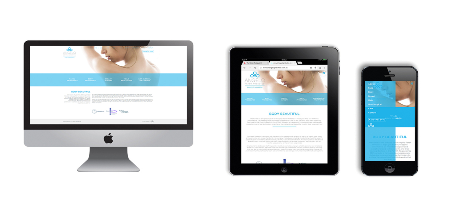
The introduction of numerous Internet-enabled mobile devices like tablets and smartphones has fundamentally transformed the website design market. The trend of using countless mobile devices to access the Internet is definitely going to grow. Mobile sites are meant to give a better user experience for mobile visitors and are specifically optimized to be seen on a mobile device. After all, browsing a desktop website on a smartphone may be irritating and annoying; sometimes, page components pile up on top of each other, and the text may be broke up or otherwise difficult to see. So, what’s the difference between a mobile site and a “responsive site”?
A mobile site is distinct from its desktop equivalent, but a responsive site is a version of your site that adapts and alters the on-screen content to fit whichever device is viewing the page.
Mobile-Friendly Websites: Google now prioritizes and rewards mobile-friendly websites in its search results. Many individuals believe that having a mobile-friendly website is sufficient. However, this may not be sufficient for the visitors to your website. In a nutshell, having a mobile-friendly design plan is the basic least you should have for your mobile visitors. A mobile-friendly website is frequently merely a condensed version of a desktop website. Mobile-friendly websites will function for mobile users, but we create them with desktop users in mind.
The most important characteristics of a mobile-friendly website are:
- Text-based phone numbers, addresses, or email addresses that can be used to initiate a call, directions, or an email message from your mobile device.
- Without Flash, you can create slideshows or picture rotators.
- Small image sizes to enable for quick loading on mobile connections—don’t expect even a 3G connection to work.
Mobile-Optimized Websites:
Mobile-friendly websites are all mobile-optimized; however, not all mobile-optimized websites are mobile-friendly. Mobile-optimized websites are made for smaller displays and are aimed at mobile consumers. A mobile-friendly website will automatically reformat for mobile users. The purpose of a mobile-optimized website is to make the user experience as seamless as feasible. Users on mobile devices are looking for the quickest and most efficient way to answer their questions. That is precisely what mobile optimization strives to achieve.
The most important characteristics of a mobile-friendly website are:
- Simplified navigation with large touchpoints that is “thumb” friendly, particularly for important contact information.
- Reduced graphics that don’t get in the way of finding important information like product lists or generic content.
- If at all possible, avoid forcing users to type.
- Allow visitors to access your site on a desktop computer.
Websites Created with Responsive Design:
Websites that are responsively developed perform precisely what the name implies. They react to the size of the device’s display. In some ways, responsive design continues where mobile optimization ends. Responsive design restructures and reformats webpages for any device, no matter how small the screen. We do this only for mobile devices with mobile optimization. For users, responsive design provides flexibility and outstanding usability across all devices. It’s basically the only method to ensure that your website looks great and functions well on any device.
Responsive design is the best development investment if you’re dealing with a consumer or audience who is active on mobile devices or needs to make purchases on the go.
Mobile-First Design Strategy:
The term “mobile-first” refers to a design strategy that prioritizes the mobile version of a website over the traditional desktop version. We can also apply this design method to products or services that are build and marketed first for mobile users rather than conventional internet consumers. Many design challenges arise from cramming too many things onto a single page. When developing for mobile-first, the design structure tends to be simpler and cleaner. This is a good starting point because it’s easier to add significant functionality to the desktop version as needed rather than trying to cram everything into a mobile version.
A mobile-first strategy is where you can give your customers complete focus on mobile view then simultaneously go to desktop view and so on.
So, what is Mobile-First Indexing?
On November 4, 2016, Google stated that it had begun experimenting with mobile-first indexing. Therefore, if you have a different URL for your mobile version of your site, Google recommends that you start optimizing it for SEO. This statement may have been timed to coincide with the fact that, for the first time in internet history, mobile internet usage has surpassed desktop for the first time!
What is mobile-first indexing, and how does it work? It’s the process of a search engine crawling and organizing data on your mobile-first website. When someone searches, the search engine will know how to best serve up relevant results. Indexing that prioritizes mobile devices is mainly referring to as mobile-first indexing. In order to index and rank content, Google mainly uses the mobile version. However, when determining the relevancy of a page to a user’s query, the index formerly relied heavily on the desktop version of its content.
Is It Necessary to Develop for Mobile?
We’ve recognized for a long time that improving the mobile experience is critical. However, Google favors mobile-friendly sites when searching on a mobile device; many business owners have not prioritized it. Google recently states that mobile-first indexing would be enabled by default for new websites beginning July 1, 2019. They’ll keep rolling out to older sites as Google determines they’re ready. If you’ve been putting off mobile website optimization, you may be doing more harm than good. You could risk dropping in the search ranks or raising your bounce rate if you don’t have a mobile-friendly website, neither of which is good for your earnings.
Bottom Line
The purpose of a website is to take visitors on a digital trip. Designing of that voyage must be as painless and uneventful as possible. The simpler your website is to navigate, the more likely you are to generate conversions. A responsively built or mobile-optimized site will provide you with a higher ROI in the long term than an only mobile-friendly site. Now, whether or not the expense is justifiable must be determining by the type of business.
Do you find this blog interesting? Then please check our blogs too. If you have any queries, then please do contact us. We are here to help you out! To know more about us and our services, then check out our website.


